During the Covid lockdown, I was finally able to work on a project I had been thinking about since 2017, when Adidas became the jersey provider for the NHL: concepts fixing various branding and design issues for every team. The primary goal was to clean up the awkward collar pattern used by the “Adizero” template. It forced several teams to make less than ideal decisions about coloring, resulting in a few truly hideous collars. For example, the red trapezoid on the Rangers home jersey, the ungapatchka of the Flyers road jersey, or Montreal’s reverse “priest collar”.
I then proposed practical refinements to each team’s set of home, away, and alternate jerseys, drawing from their rich visual history to transcend different eras, feel cohesive, and look timeless. A few of these concepts conceived even before 2021 ended up being very close to what a few teams have subsequently released. 💪😎
I used sportstemplates.net‘s super cool jersey builder to create these concepts. Browse through them below, or jump to the bottom to watch a popular hockey YouTuber review the concepts (and have his mind blown).
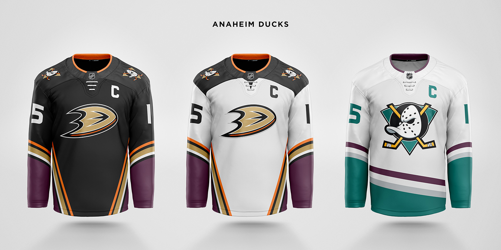
The original eggplant color replaces the blocks of orange on the sleeves and torso. Instead, orange is used as an accent color to preserve the nod to Orange County. The away shoulder yokes lose the piping. The third jersey is essentially the original Mighty Ducks jersey with more moderately angled stripes. While it’s important to recognize the fan’s love for this jersey, I also understand the ownership’s desire to separate itself a little from the Disney era and not make a full return to the Mighty Ducks logo.

Kachina for both home and away. The logo uses the simpler Peyote Coyote head in favor of the full, “hockey player on a hockey player” logo. The alternate gets a Kachina stripe added to the sleeves.
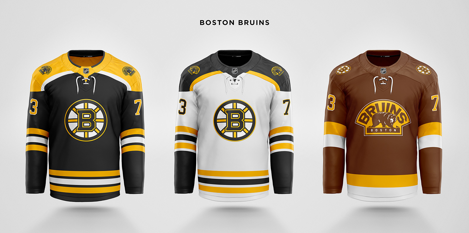
Only small changes to the Adizero collar for home and away, and a new third with their original brown and the 2008 update of the original logo.
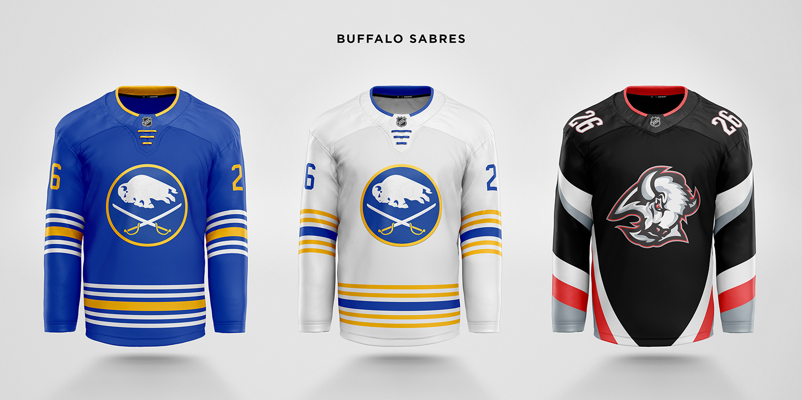
The return to royal blue is a great decision. The only changes here are to use the embroidered logo and more unique stripe pattern from the 50th anniversary jersey, and adding straight laces. In the logo, the buffalo silhouette is enlarged and the motion lines are removed. The alternate is the return of the Goat Head jersey, with the brilliant buffalo head hidden in the striping. Numbers are moved to the shoulders to declutter the sleeves.
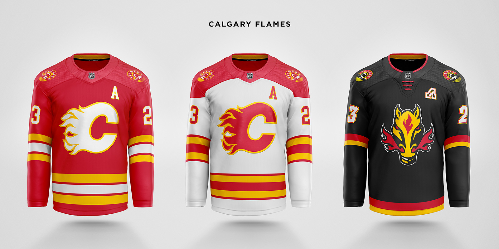
The roundel alternate logo from 2013 is now a shoulder patch. The third is very similar to the 2021 Reverse Retro, with a slightly modified Blasty logo, straight stripes and laces, and the flaming C and A lettering.
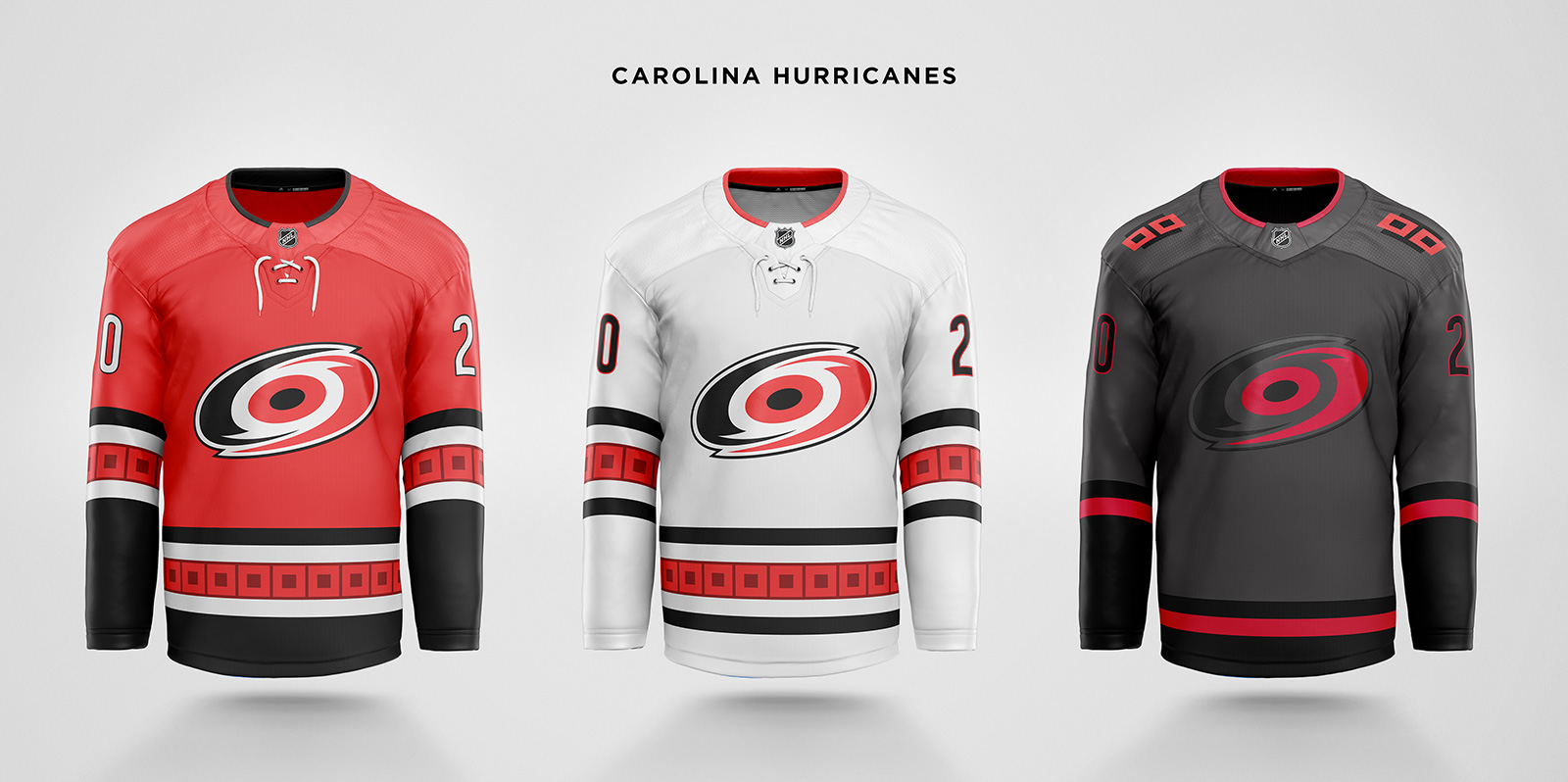
The branding most in need of a fix is Carolina. The poorly drawn lines of the 3D hurricane eye/puck are removed by flattening the logo. This logo is used on all three jerseys, ditching the away’s diagonal abbreviated wordmark and the third’s awkwardly shaped flag warning stick logo. The third uses the dark gray from the shoulders instead of black and gets a new shoulder patch based on the flag.
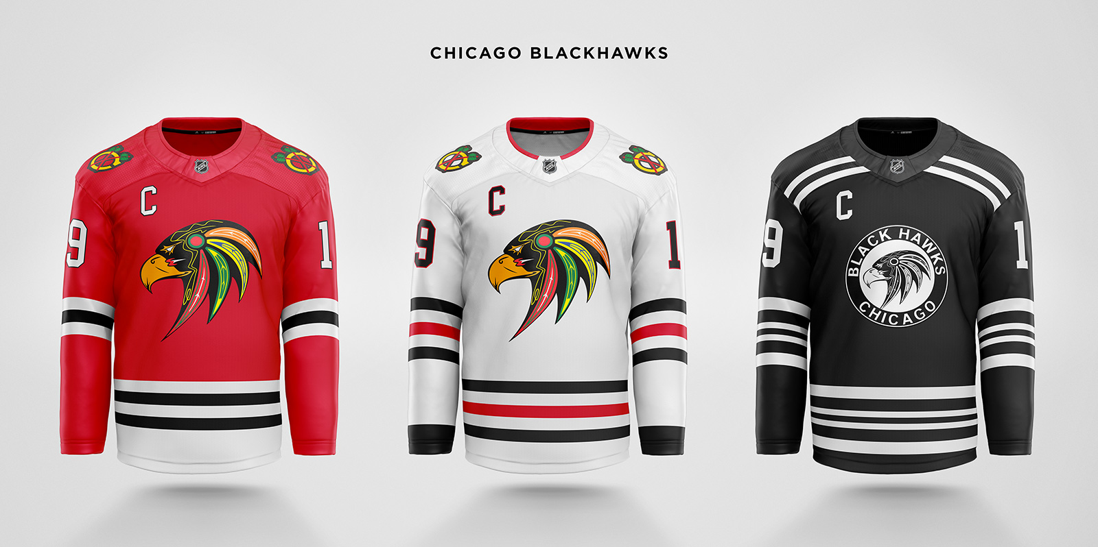
Whether or not you think the current logo is offensive, what if it was changed to a literal “black hawk” to just avoid the question altogether? These concepts use a logo created by Ojibwe artist Mike Ivall, attempting a culturally appropriate design. The third jersey is based on the original black from 1927-1934.
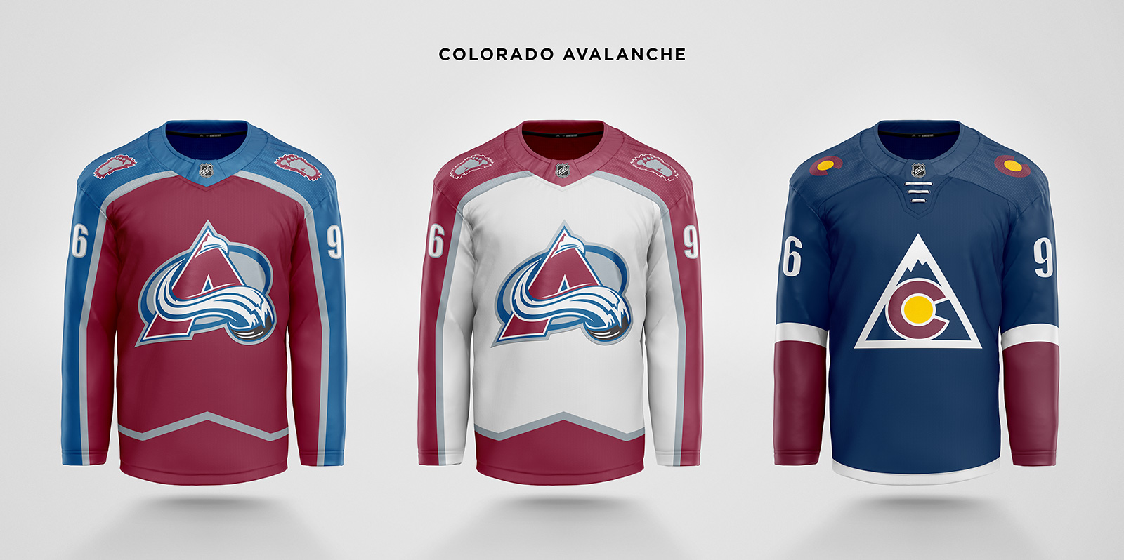
The Adizero collars are now one color, the bottom of the home jersey is changed from blue to maroon so the new blue pants feel less high-waisted, and the yeti foot patch returns. The third jersey loses the oddly wide shoulder yokes and adds the yellow from the state flag back to the C logo.
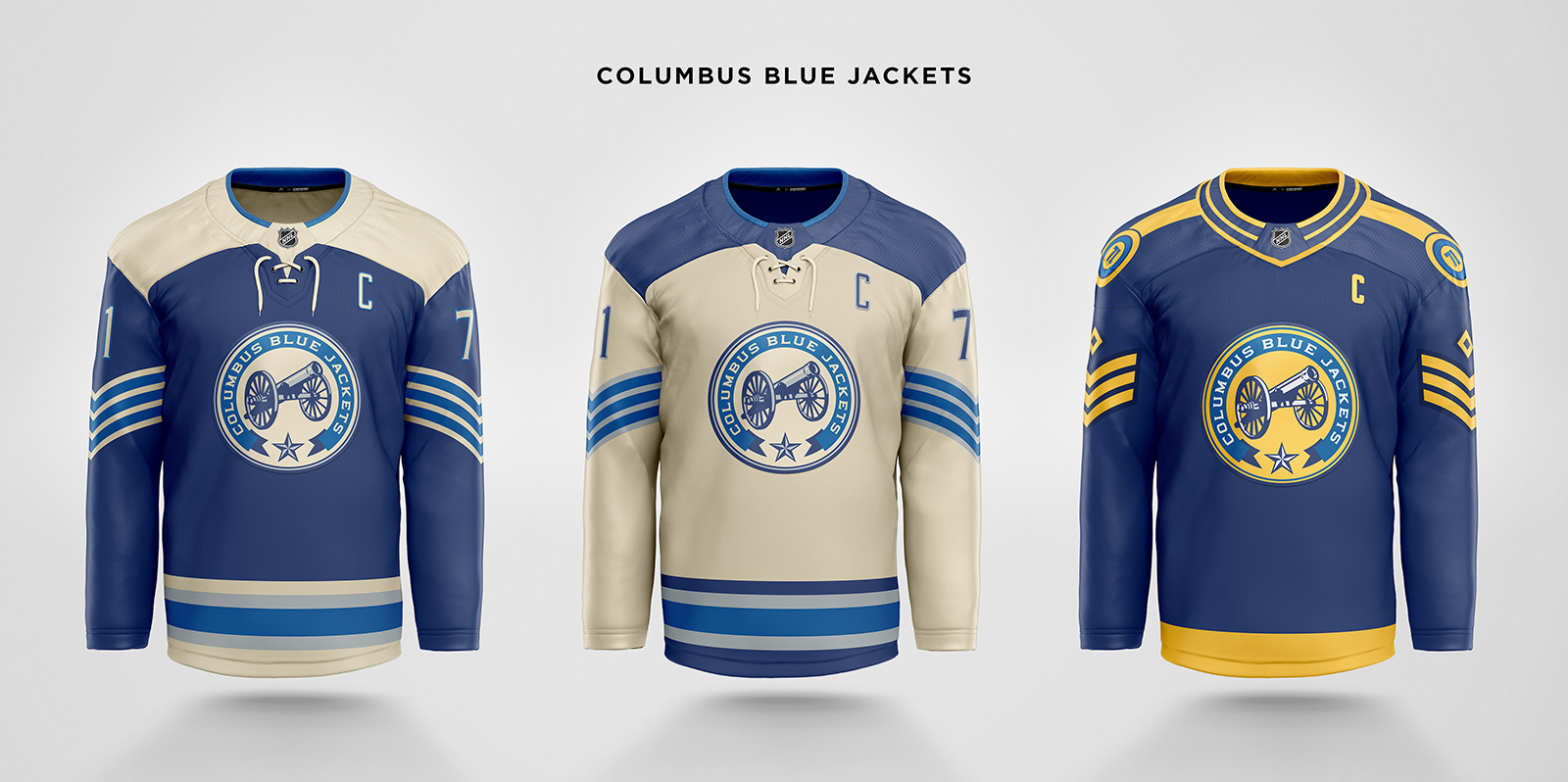
The alternate becomes the primary, with new sleeve stripes mimicking Union soldier chevrons. A new alternate tries a more literal design for “blue jacket”, using the chevrons to indicate captain and alternate captains, and shoulder epaulettes to display the player number like regiment numbers.
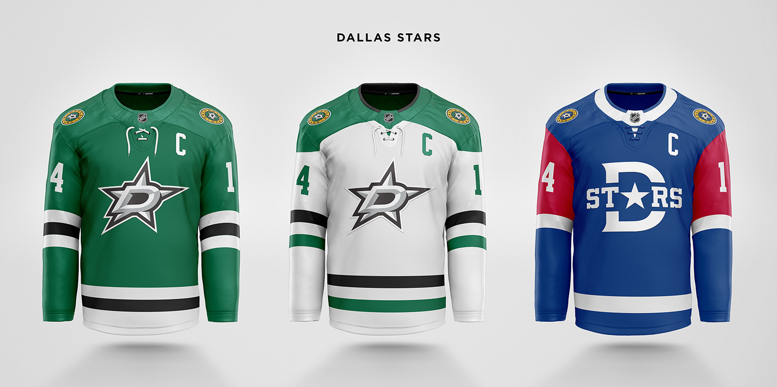
The collar is changed from white to green on both home and away, and the shoulder patch gets a splash of yellow from the Dallas flag, which is also a nod to the North Stars colorway. The third jersey gets the full Dallas flag treatment and the big D logo from the 2020 Winter Classic.
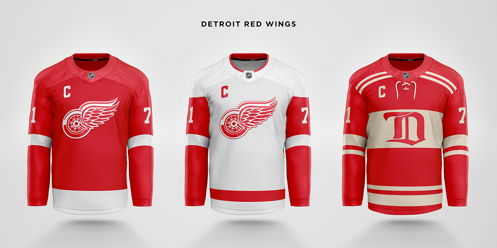
Slightly wider stripes and a white collar with red trim on the away jersey are the only changes to the primaries. The third is a blend of the 2009 and 2014 Winter Classic jerseys with the original Cougars Old English D logo.
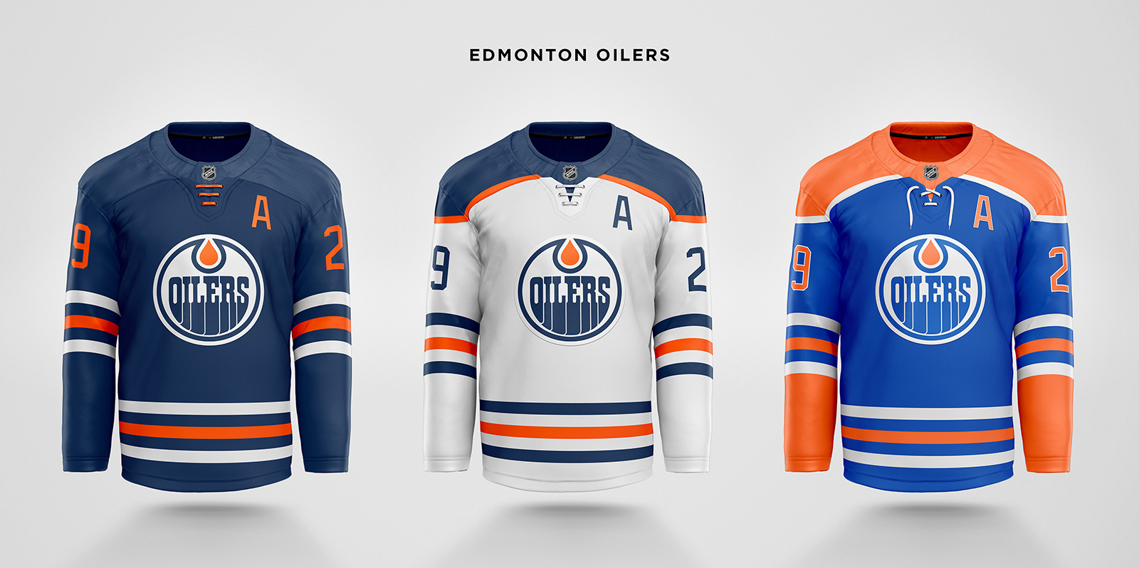
The home jersey is based on the current alternate using dark blue as the primary color and no shoulder yokes, which also resembles the late 90s design. The away jersey is essentially unchanged, while a new alternate is a return to the dynasty days.
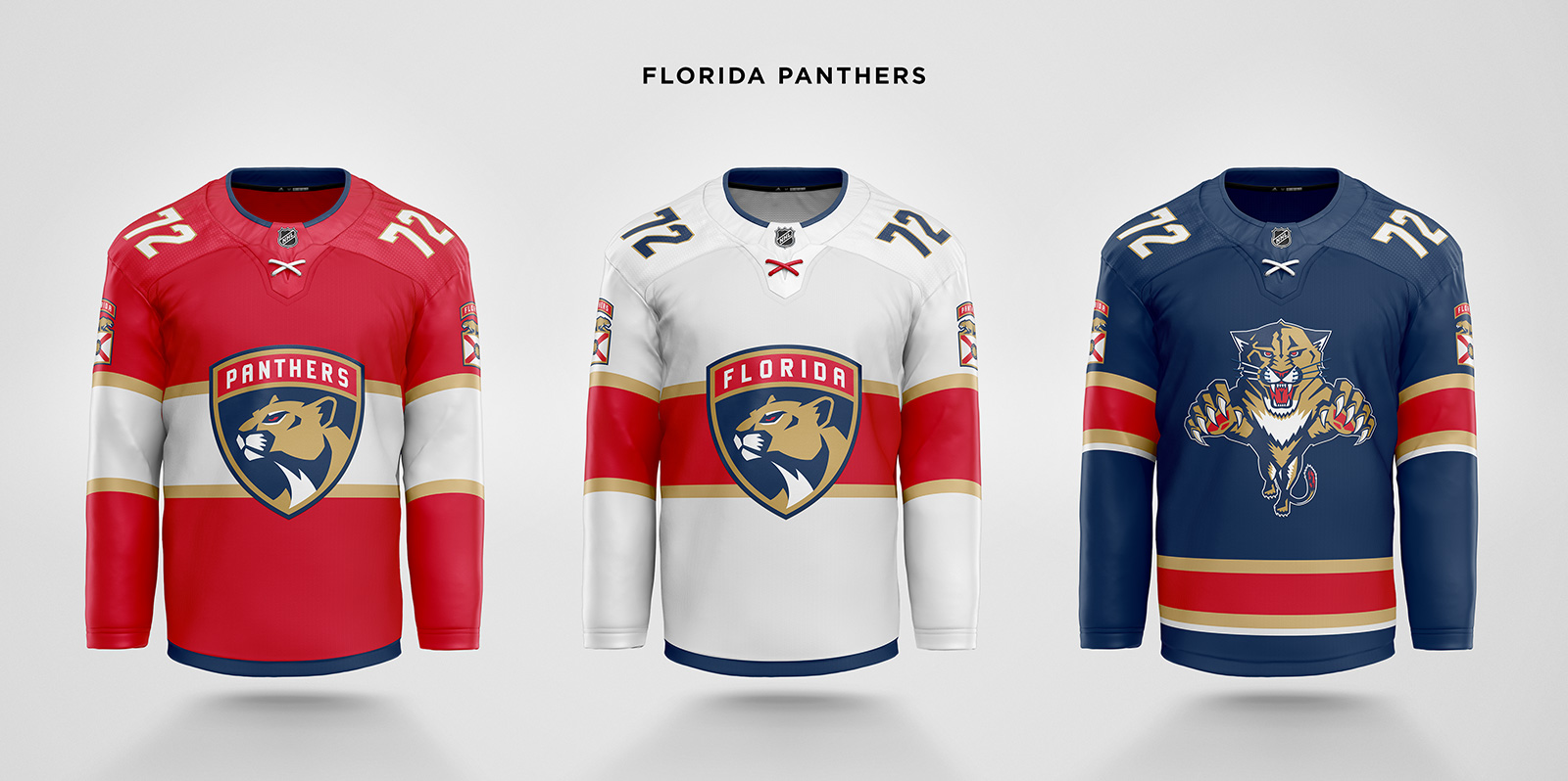
A blue trimmed Adizero collar is the only change to the home and away jerseys. The third is inspired by the first blue jersey from 1998 and gets the original leaping panther logo.
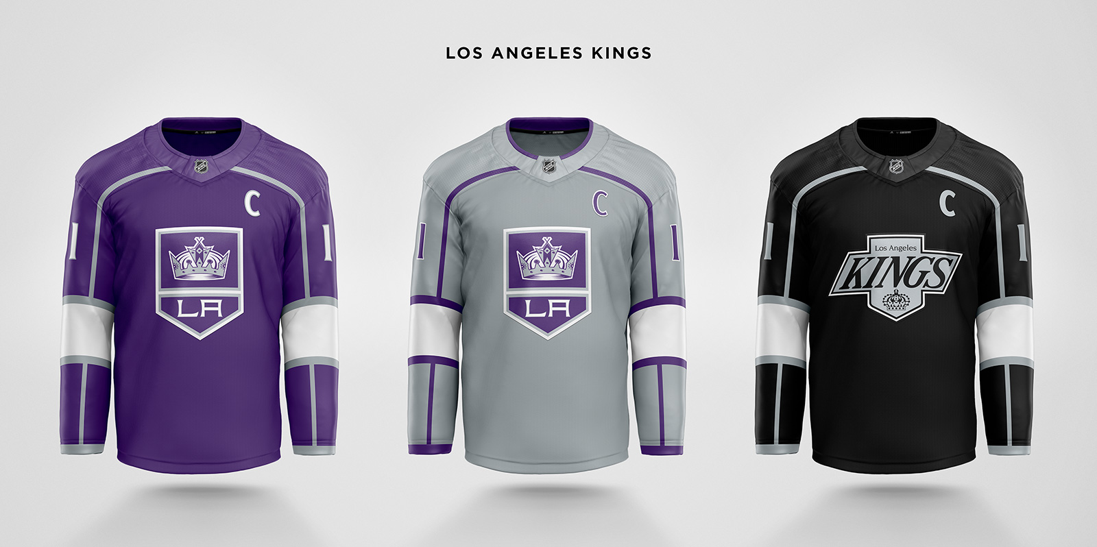
Forum blue and gold works for the Lakers, but aesthetically I don’t think it works for a hockey team. So a darker, more regal shade of purple replaces the home black, while silver is used for the away’s base color. The logo also has the crown and initials swap positions. The third jersey is a composite of the current jersey template and the Gretzky-era logo minus motion lines.
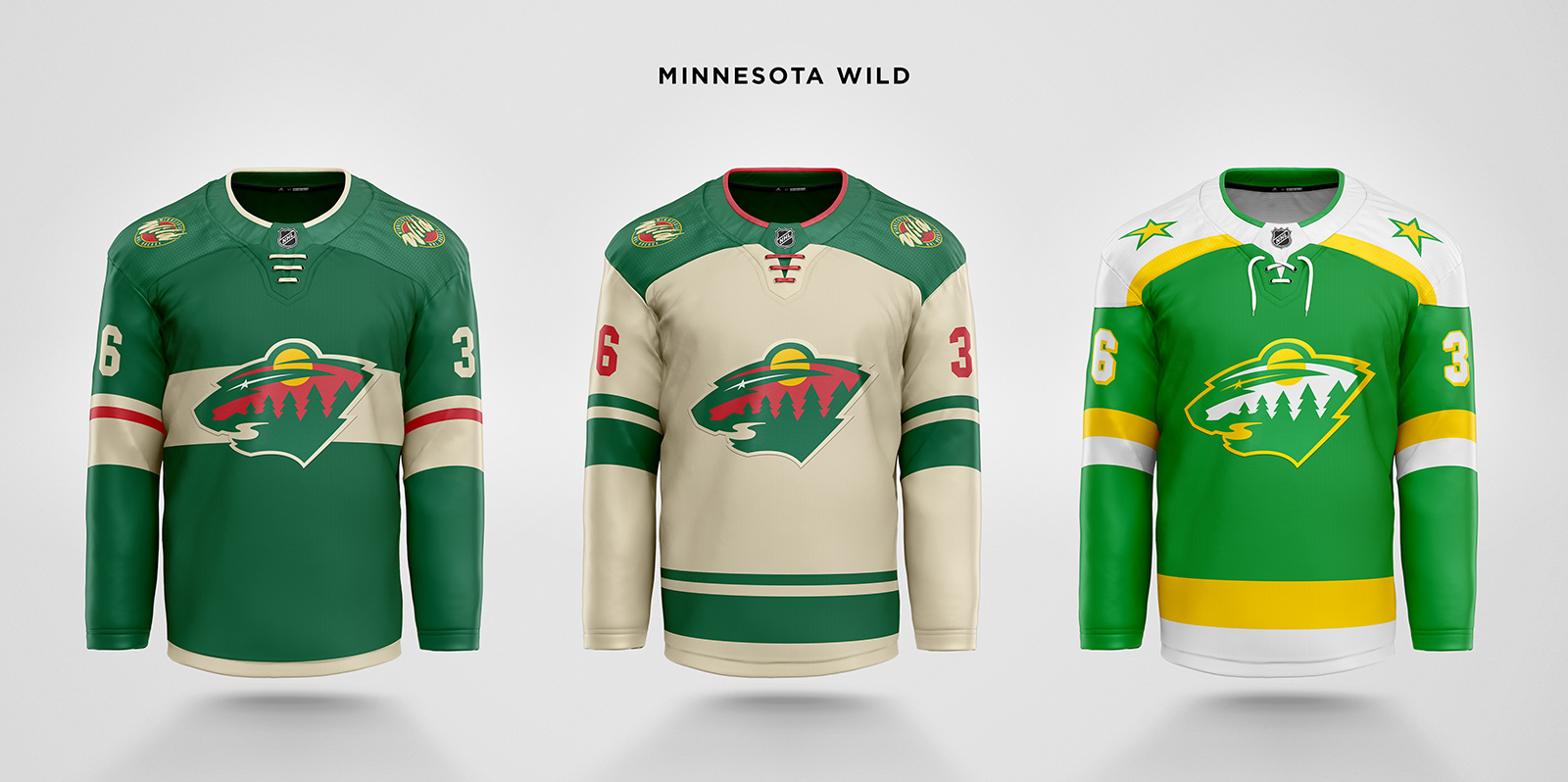
The primaries see the return of the inaugural shoulder patch in addition to minor collar tweaks. The away also gets a cream base instead of white, and the third uses the North Stars template and colorway from their strong early 80s teams. The star from the North Stars logo is turned into a patch for the alternate jersey.
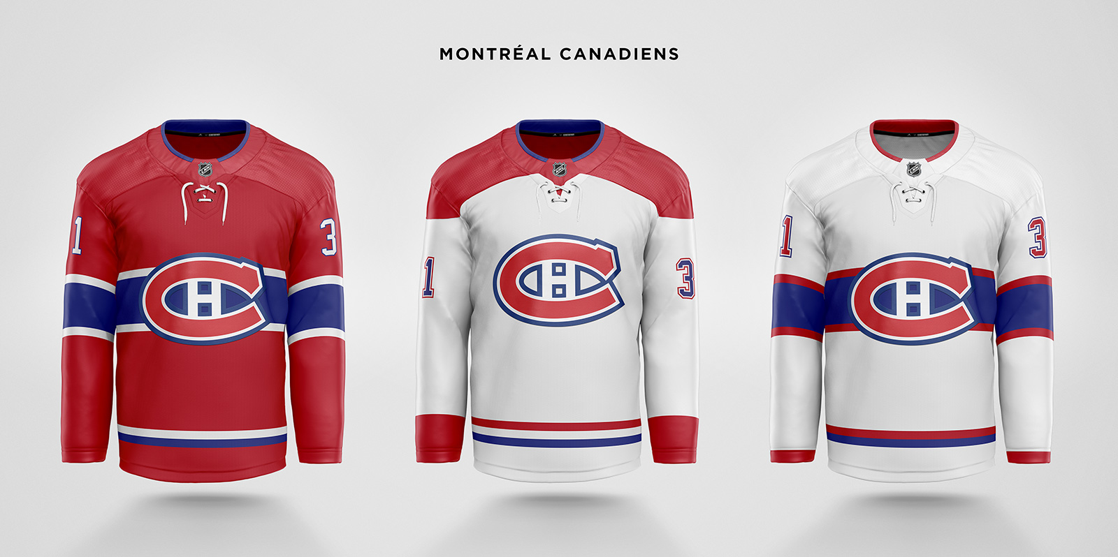
Only touched the Adizero collar, making it solid red with blue trim on the primaries, and white with red trim on the 1944-47 based third jersey.
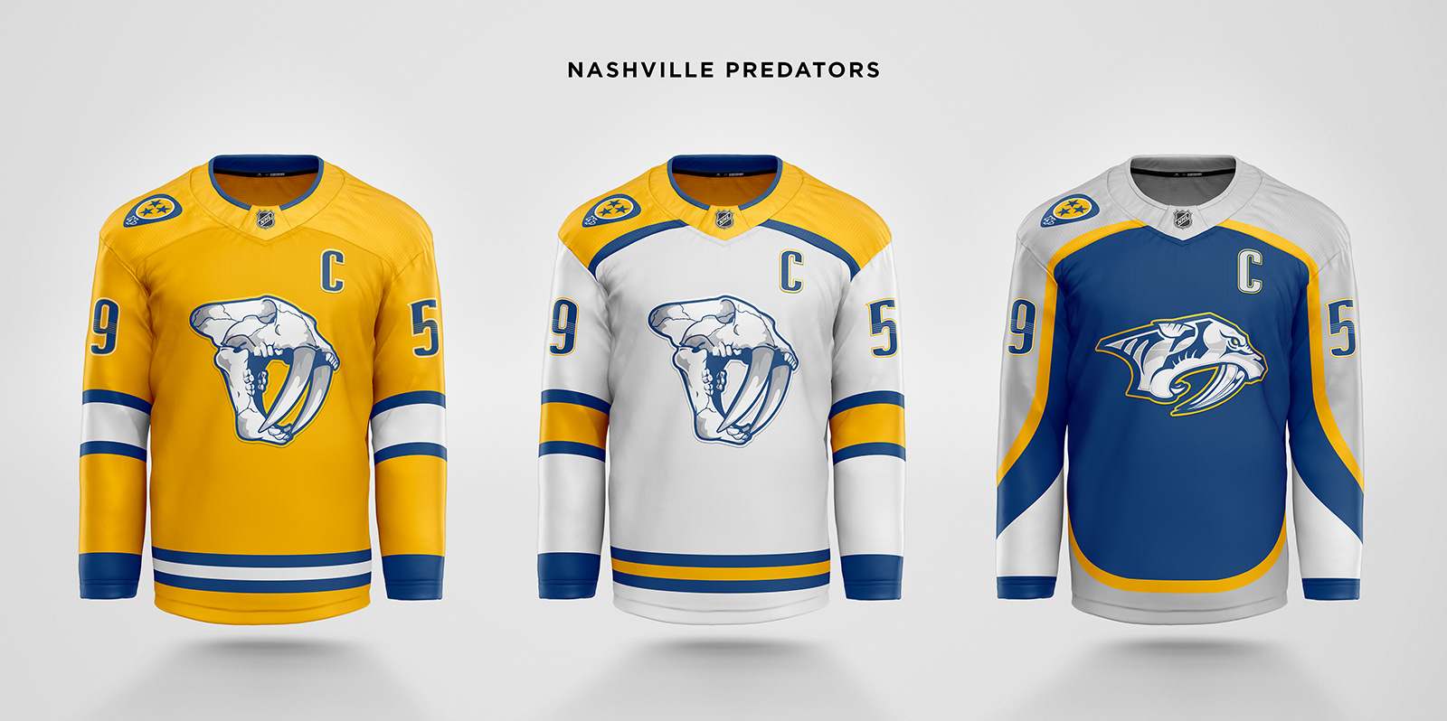
The sabretooth tiger head has always felt a little too cartoonish. The skull patch, however, is quite cool. That becomes the primary logo on home and away with stripes borrowed from the 2020 Winter Classic. The current primary logo moves to the third using a template similar to the inaugural jersey.
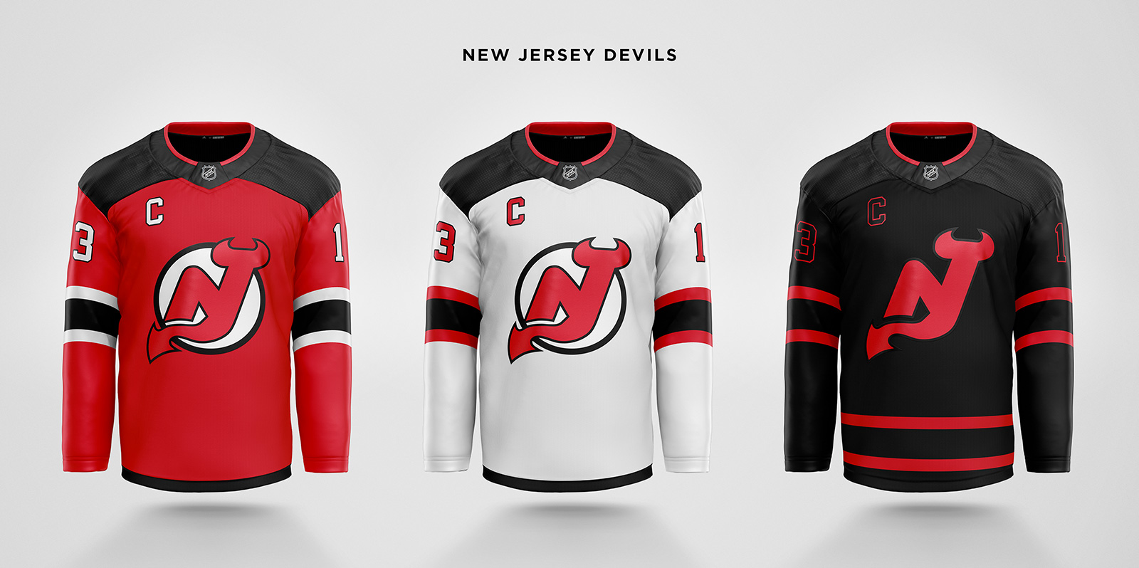
Restored the sleeve stripes from the Brodeur-era Cup winning teams, and switched the letter to the right. A new all-black third jersey with red stripes feels more devilish than the Christmas jerseys.
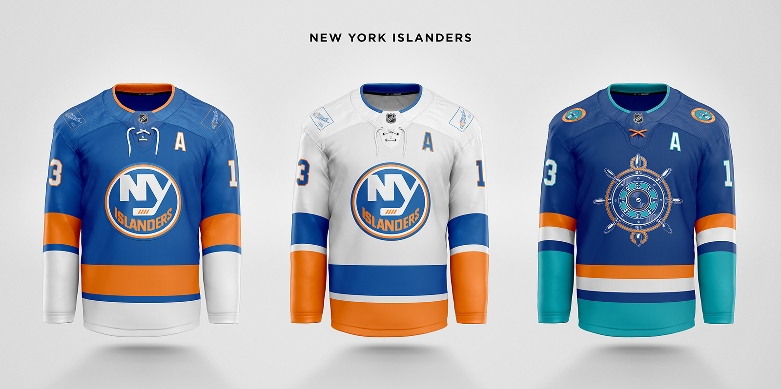
Reflecting their move to Belmont Park, the Long Island silhouette is removed from the chest logo and instead becomes a commemorative shoulder patch with Nassau County highlighted. The third jersey uses the Fisherman colors and a new nautical theme for the branding. A ship’s wheel is used for the main logo and a lighthouse for a shoulder patch.

The Adizero collars are simplified on the primaries, and the shade of blue is also lightened to be closer to the original 1926 blue. The third jersey uses the 2018 Winter Classic base and a Mike Richter-inspired version of the Lady Liberty logo.
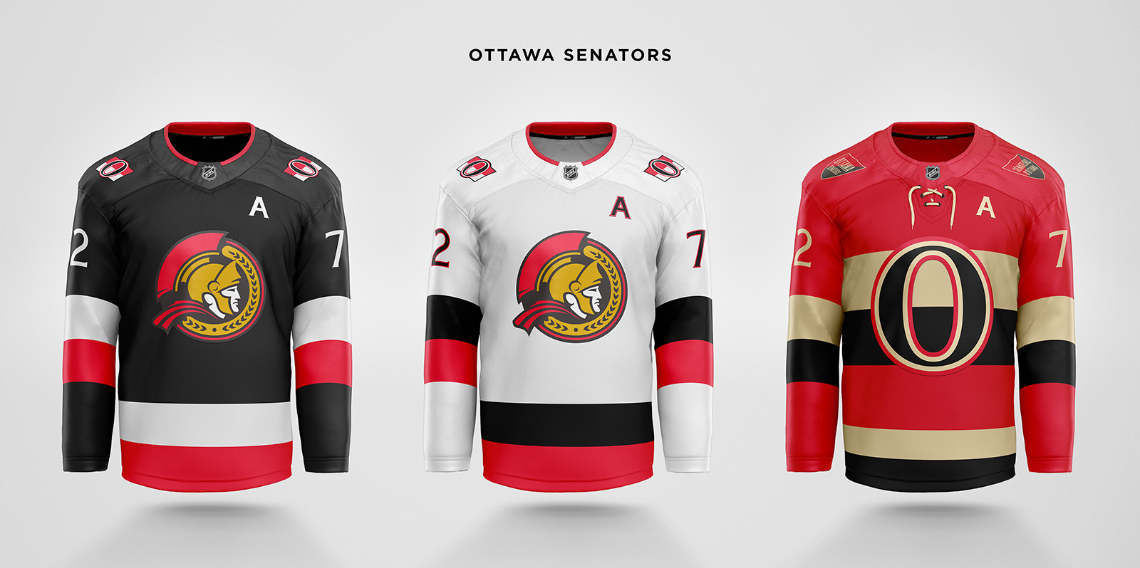
The return to the 2D senator logo is the right move, however, these concepts use the 2007 version of the logo. While Ottawa fans prefer the original, this is the better constructed logo. The senator’s head is positioned more naturally, the laurels are symmetrical, the cape is a nice nod to the Ottawa flag, and the more circular shape allows the logo to be centered on the jersey. The sleeve stripes on all three jerseys are inspired by the original Senators.

The trademark shoulder yoke stripe is curved into a cleaned up Adizero collar on the primaries. The third is an amalgam of several jerseys: the late 90s black Legion of Doom, the 2012 Winter Classic, and a reverse of the 2021 Reverse Retro.
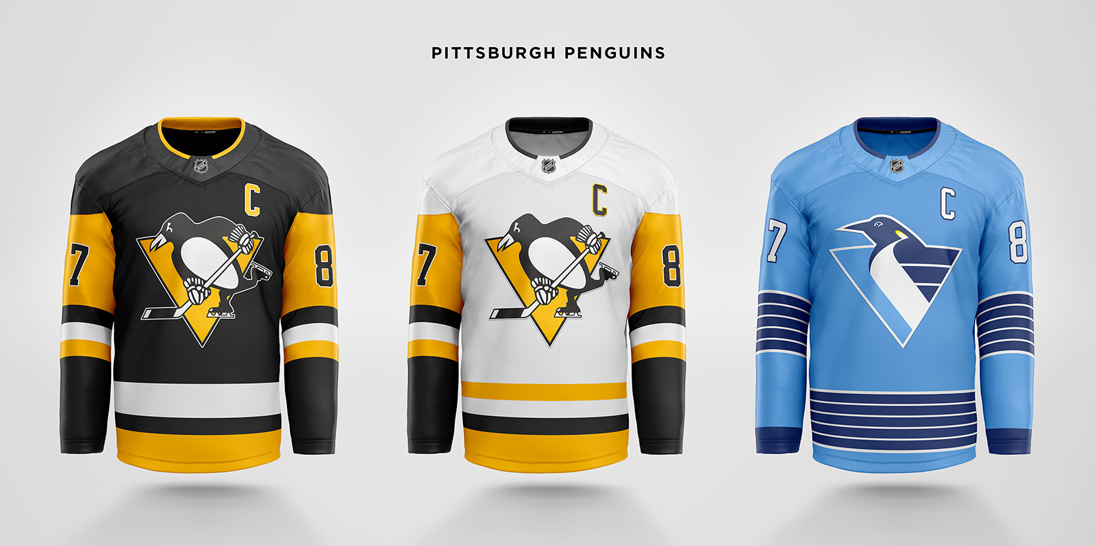
Only a small change to the home and away collar. A new third jersey combines the robo-penguin logo with an “icier” shade of powder blue and dark blue stripes.
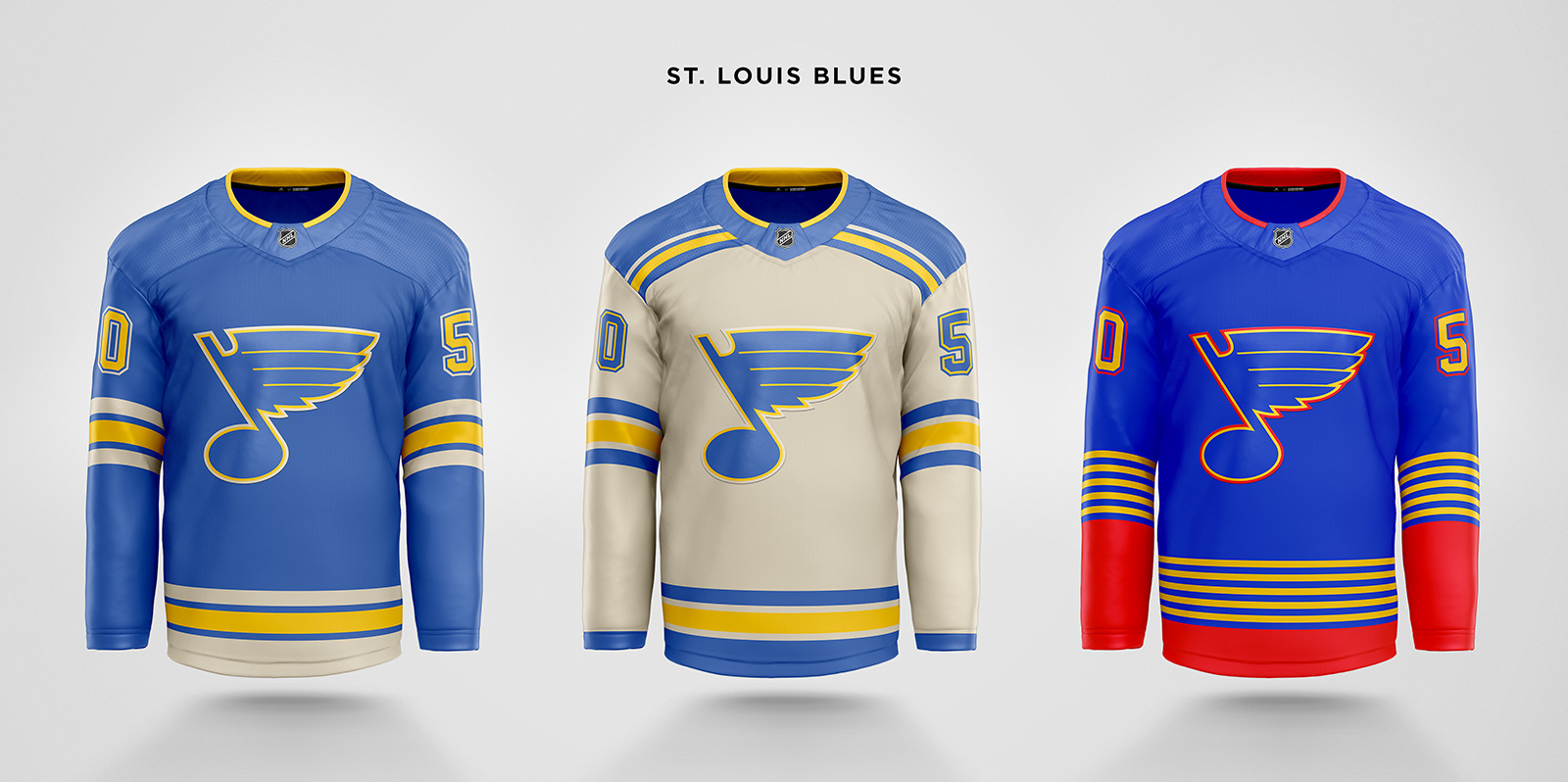
The 2017 Winter Classic jersey becomes the primary home, with a cream-based version for the away. In a sea of blue jerseys, this shade helps make St. Louis a little more unique. The alternate brings back the mid 90s design with straight stripes.
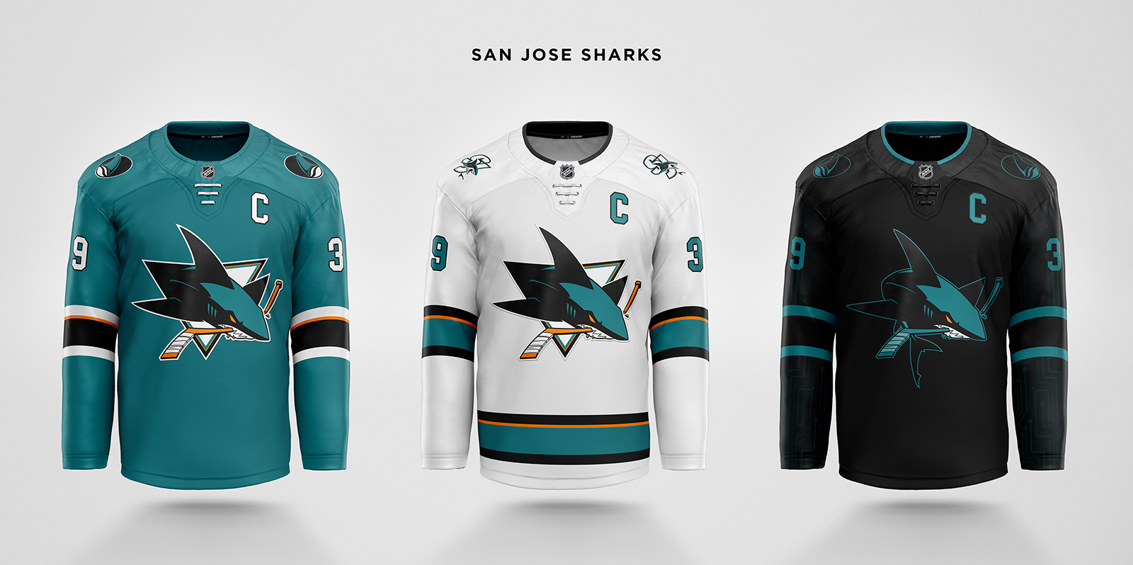
Only two small changes to the home jersey. First, the shoulder patch is mirrored so the fin is always moving forward, and second, the laces are now straight. The away jersey brings back the waist stripes. The third uses the alternate shark logo, and has a circuit pattern applied to the whole sleeve instead of just the sleeve stripe.
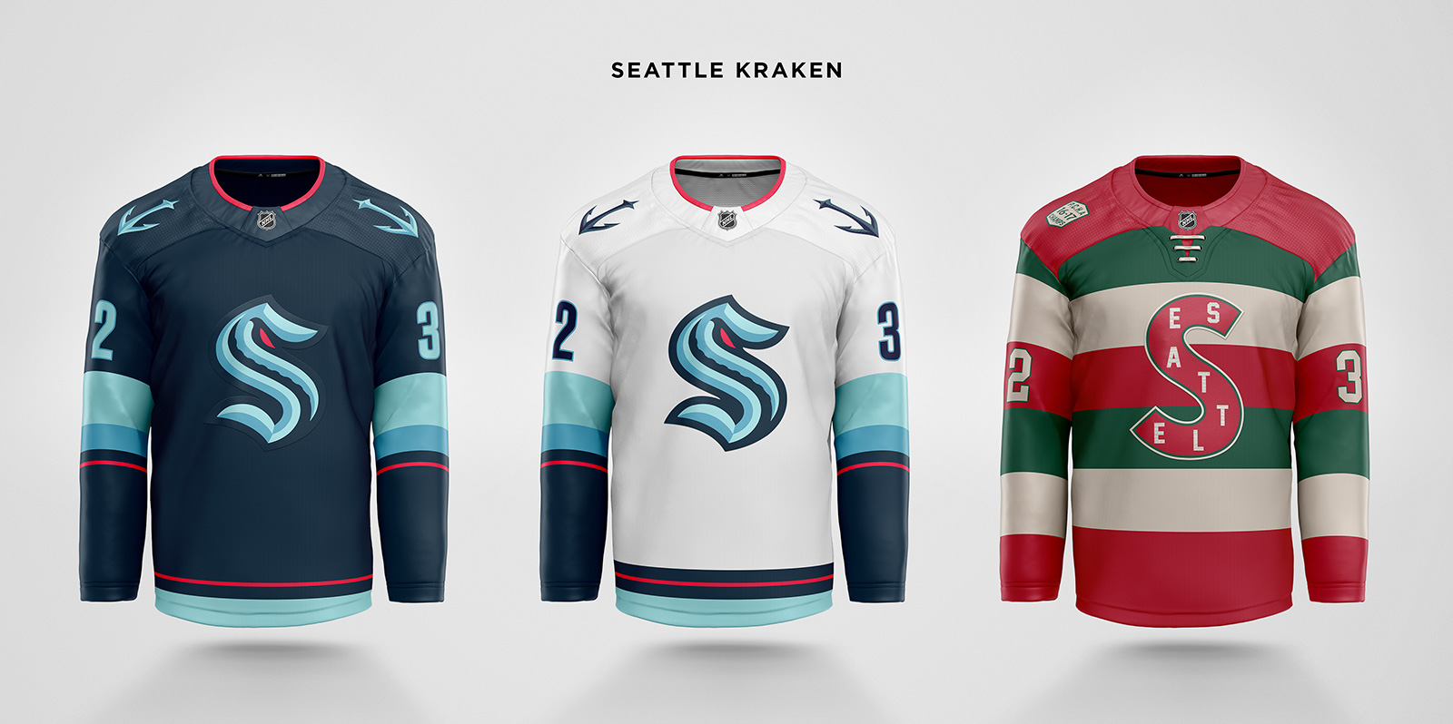
Seattle’s branding and jerseys are incredible. Other than a small change to the Adizero collar using red for the trim, I didn’t think I could improve upon anything else. The third jersey is a no brainer homage to the first American team to win the Stanley Cup, the Metropolitans. A shoulder patch recognizes their PCHA roots and first championship.

The Disrupt the Night third becomes the base for the primaries. Instead of the timeless look they tried to achieve with their Toronto clones, the Disrupt jersey achieves a much more interesting and unique look for Tampa. The only change is to replace storm gray with blue in the sleeve gradient, and obviously to create an away version. A new alternate is based on their inaugural jersey but with blue as the main color. The logo is redrawn to make “Bay” read less like “Ray” and to remove “Lightning”.
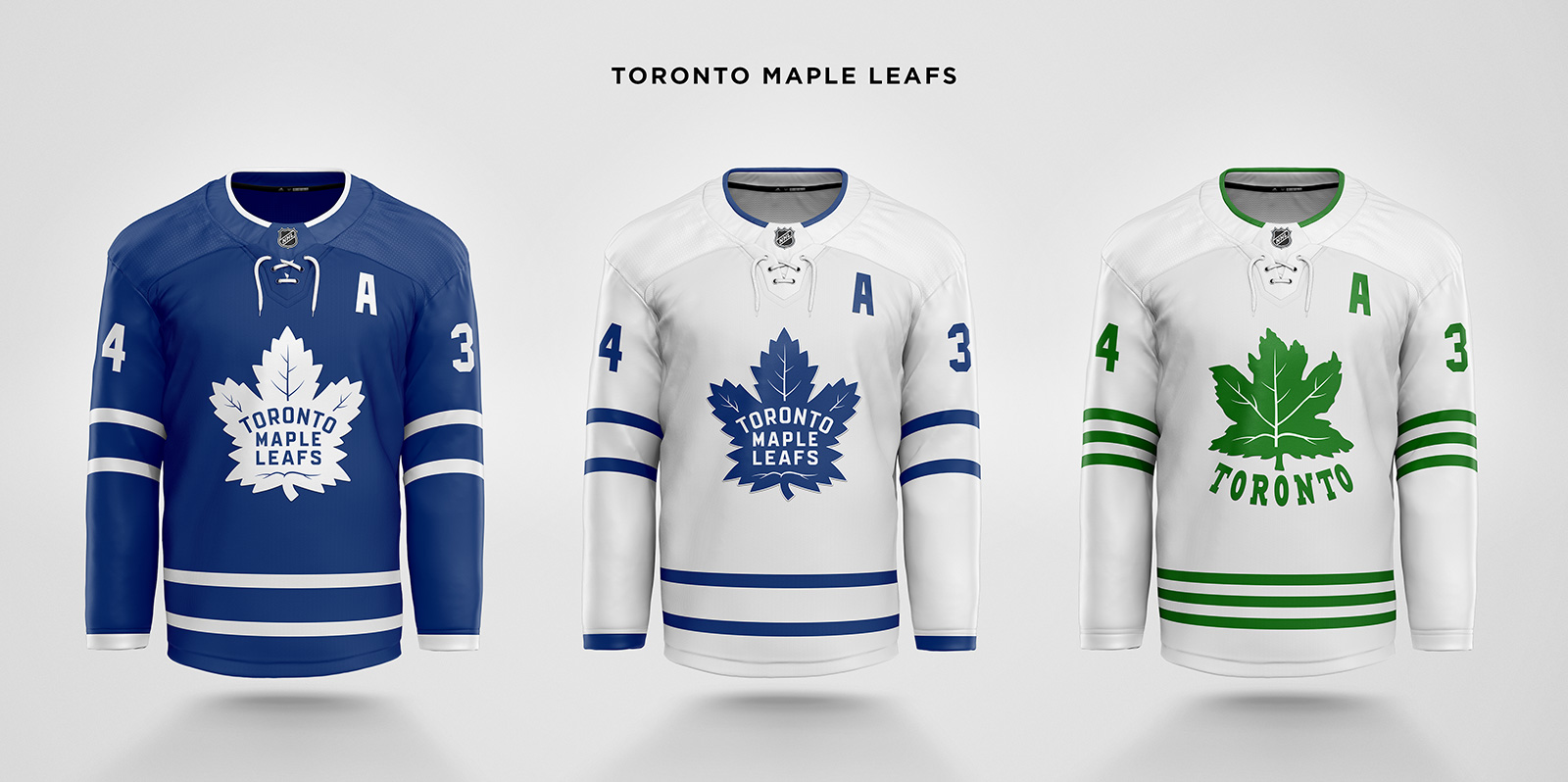
The primary jerseys have double stripes restored to the waist to match the sleeves. The alternate is a hybrid of the Leafs’ original green logo and the current logo, with triple stripes from the St. Pats jersey.
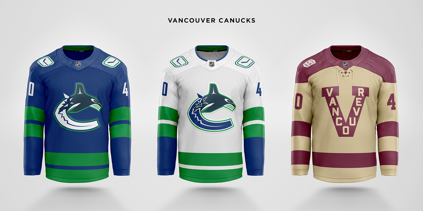
Vancouver’s recent refresh is almost perfect. The primaries are revised to use the thicker stripes from the current alternate, while the Orca logo has gray removed. A new alternate is based on the Millionaires 2014 Heritage Classic jersey with colors reversed to be able to be worn against Seattle’s alternate. Also like Seattle, a shoulder patch commemorates the Millionaires’ first PCHA championship. It was a difficult choice to not feature a flying skate alternate, but the opportunity to celebrate a rivalry from a century ago was too tempting to pass up.
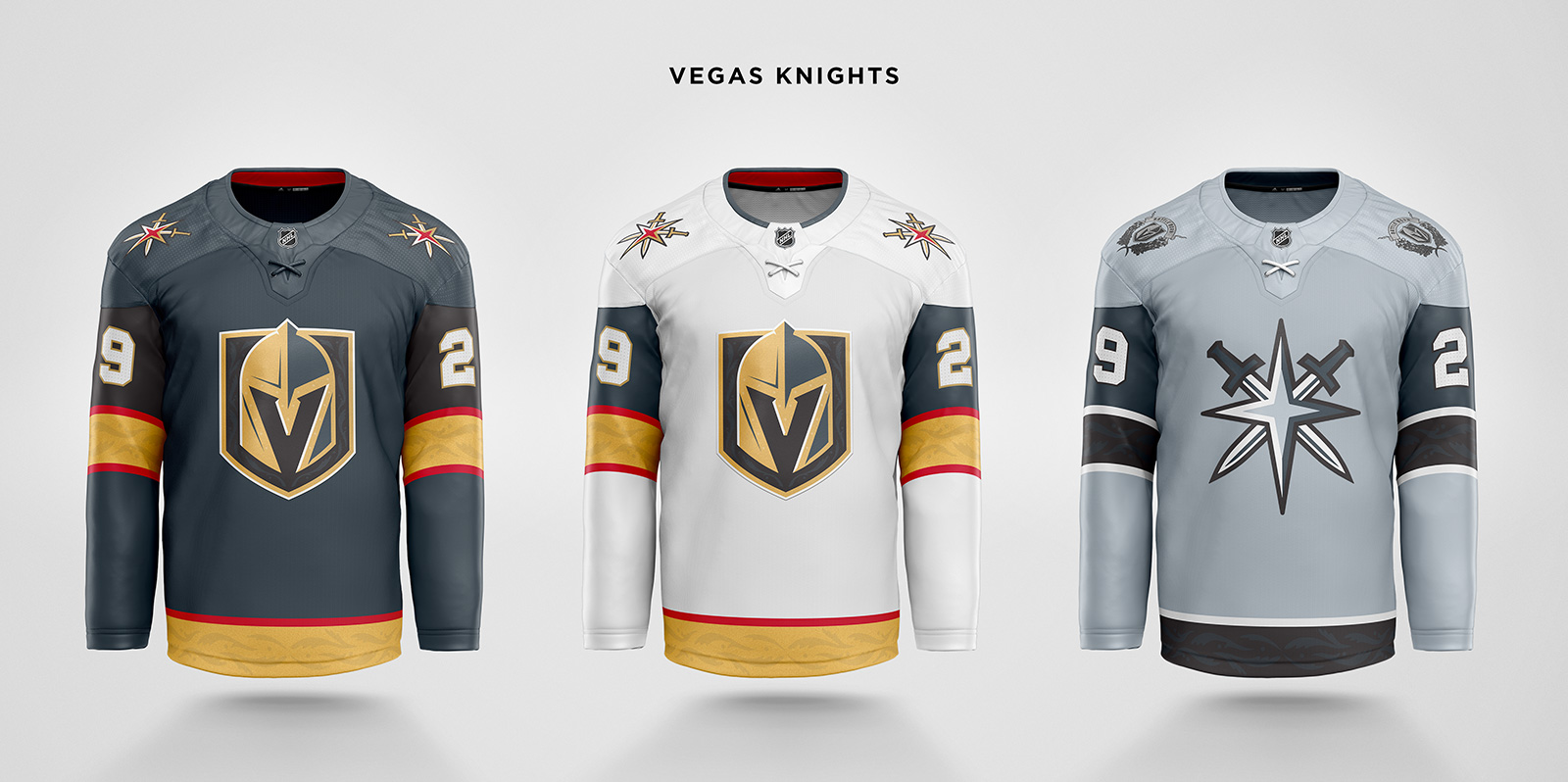
“Golden” is dropped from the name anticipating an eventual copyright compromise. Gold remains an important color, however, and the embroidered metallic gold stripe is added to the waist. Cross laces are added to resemble a knight’s tunic. The alternate jersey is a “shiny armor” monochromatic version to complement the Raiders, and to create a medieval marquee matchup against the Kings black alternate. A “Battle Born” shoulder patch completes the look.

The Weagle logo is too good for just a patch. It moves to the chest, while Old Glory replaces it on the shoulder. Stars and stripes further decorate the sleeves, and a blue alternate completes the red, white, and blue theme for the District.
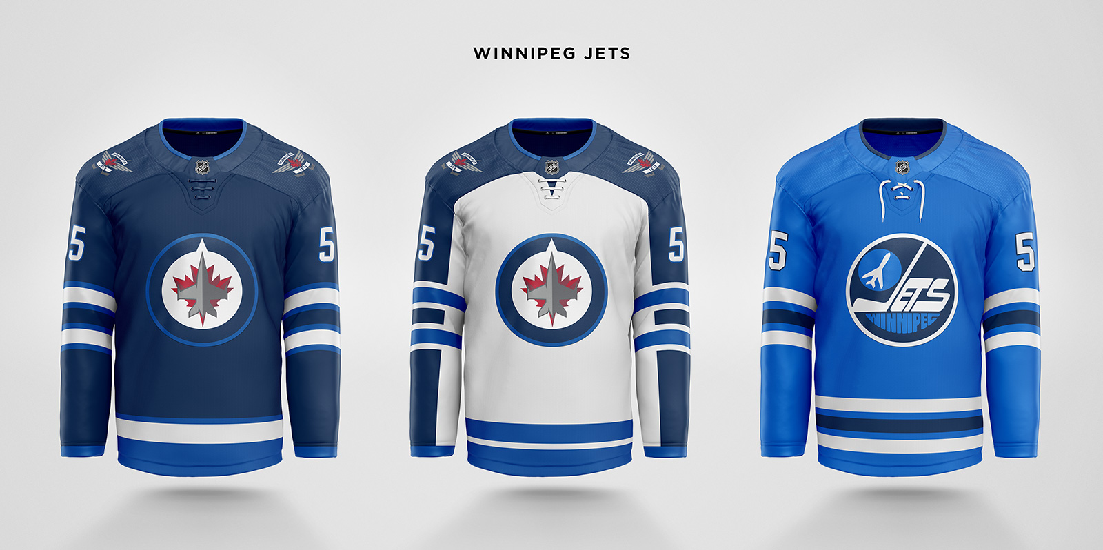
The big change to the primary jerseys is the replacement of gray with the lighter blue in several places. Gray is instead reserved for the metallic portions of the jet in the logo and wings in the patch. The alternate is a combination of the current Aviator blue third jersey and the original Jets logo, with striping borrowed from the Heritage Classic jerseys. Instead of the red, white, and blue combination that many teams already use – and particularly similar to the Rangers Heritage colors – the third’s colorway is limited to the primary dark blue, Aviator blue, and white.
